You know that feeling when you step into a room and immediately want to curl up with a good book? It’s not magic. Cozy rooms share a secret: they get the details right, and curtains play a huge role. People often underestimate how much color can shape a room’s mood. Go too dark, too cold, or too bold, and suddenly the space feels off. Get it just right, though, and you’ll want to hang out there all day. Curtain color isn’t just about matching your couch. It’s an invitation for comfort, a subtle design nudge that says, “relax here.” But with literally every shade under the sun, how do you choose? Let’s break down the science, the psychology, and some real-world hacks to make picking cozy curtain colors feel like a breeze.
The Cozy Color Science: Why Curtain Colors Matter
Colors do more than fill up space. They hit your brain and body in surprising ways. Ever notice how a room with cool blue or gray curtains often feels chilly—that’s not just your imagination. Multiple studies, including one from the University of British Columbia in 2015, show that people associate warmth with colors like deep reds, oranges, and golds. These hues literally make you feel warmer and safe. Meanwhile, certain cool hues—think icy blue or clinical white—tend to signal distance and sterility. When it comes to curtain colors, even a small shift in shade can change the whole vibe.
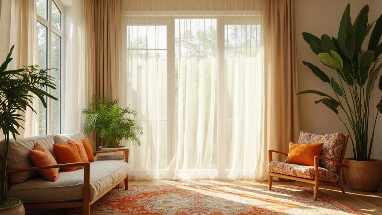
Natural light also teams up with curtain colors to whip up either coziness or coldness. Heavier, darker curtains—like chocolate brown, forest green, or rust—absorb sunlight, muting the harshness and cranking up intimacy. Chiffon-like sheers in cream or sand diffuse light gently, taking the edge off midday glare while still letting your walls breathe. There’s even a stat from the UK’s Sleep Council: 38% of their survey respondents said dark, heavy curtains helped them relax more at home. So, curtain choice isn’t just an aesthetic decision—it can directly affect your comfort, mood, and even sleep.
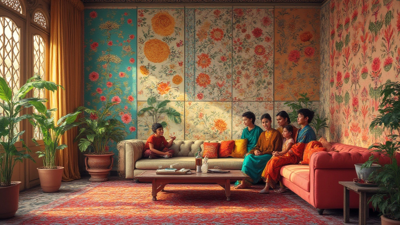
Of course, science is only half the battle. What looks cozy to you might feel stuffy to someone else. That’s where personal taste slips in. But here’s a fun fact: according to a survey by Houzz in 2023, the top curtain colors for creating “cozy” living spaces were warm earth tones (like terracotta and taupe), followed by muted greens and deep navy. People said these colors felt welcoming without being overwhelming. In Wellington’s temperate climate, where you get a long gray winter, homeowners say they lean toward these richer, deeper hues because they “make rooms feel like a hug against the cold.”
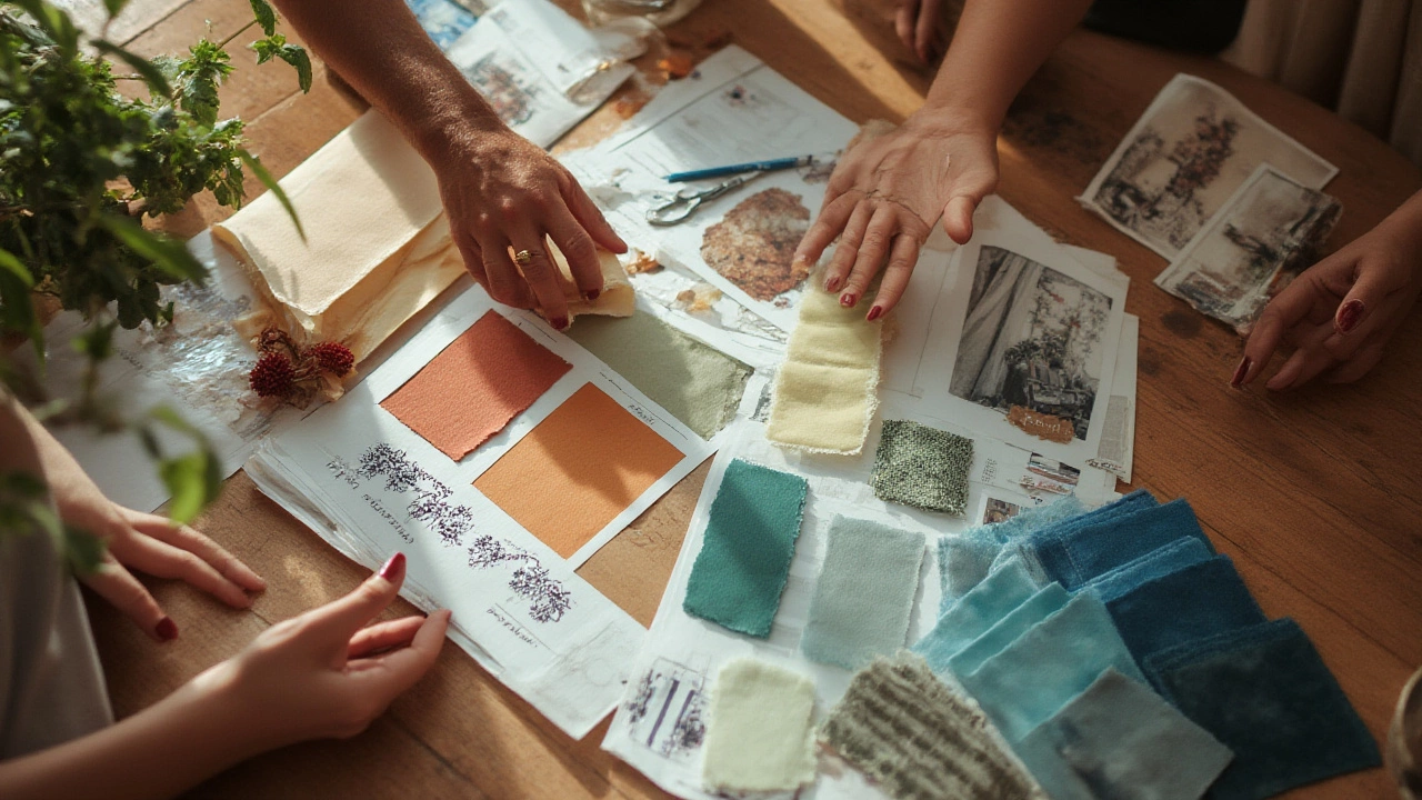
But don’t just limit yourself to the classics. Patterns and textures—like plaid in burnt orange or velvet in deep plum—add depth, which your eyes read as warmth. Layering also counts: a sheer white panel behind a heavier maroon drape delivers extra coziness and lets you tweak the vibe for the season or mood shifts.
Still wondering what colors put people at ease? Here’s a quick reference table to stir ideas:
| Color | Psychological Effect | Best For |
|---|---|---|
| Terracotta | Warm, earthy, grounded | Living rooms, bedrooms |
| Deep Green | Calming, restful | Reading nooks, studies |
| Rich Navy | Stately, safe, enveloping | TV rooms, master suites |
| Mustard Yellow | Cheery, inviting | Sunrooms, kitchens |
| Soft Taupe | Quiet, classic, warm | Dining rooms, guest rooms |
So, once you understand how color actually works on your mind, you already have the upper hand when shopping for the right curtains. Next comes the fun part—adapting these colors to your own space, season, and lifestyle.
Choosing the Right Curtain Color for Every Room
Picking curtain colors isn’t about sticking a pin in a Pinterest mood board. It’s about understanding the bones of your room—things like how much light you get, what furniture you already have, and what you ACTUALLY do in there. The best color for a snug bedroom might make an open-plan living room feel like a cave. So, start by asking one big question: How do you want to feel in this room? This is the compass that guides everything else.
Let’s talk living rooms first. This is your chill zone—the little oasis where you watch footy, binge old Netflix series, or just stare out at the wild Wellington wind. Curtain colors that scream coziness here often lean earthy. Go for burnt orange, rich browns, or deep olive. Don’t worry about matching your sofa curtain-for-sofa; look for colors that echo or contrast your biggest furniture pieces. Muted olive-green curtains look fantastic with leather couches, while warm gold works magic with gray sectionals. Warm neutrals like taupe or caramel feel modern but still comforting.
Maybe your lounge is a sun-drenched box all afternoon. Thick taupe curtains can calm the glare, or try cocoa brown velvet for that “boutique hotel winter” vibe. On the flip side, if your living area gets more gray skies than sunlight (a Wellington winter classic), skip icy blue or sharp white—those will ramp up the chill. Go for saturated color to fill the light gap; rust, navy, or even a lush aubergine step up for the job. Don’t believe the old myth that dark curtains shrink a room. If you balance dark curtains with natural textures (wood, plants, hand-thrown pottery), they actually make the space feel intimate, not tiny.
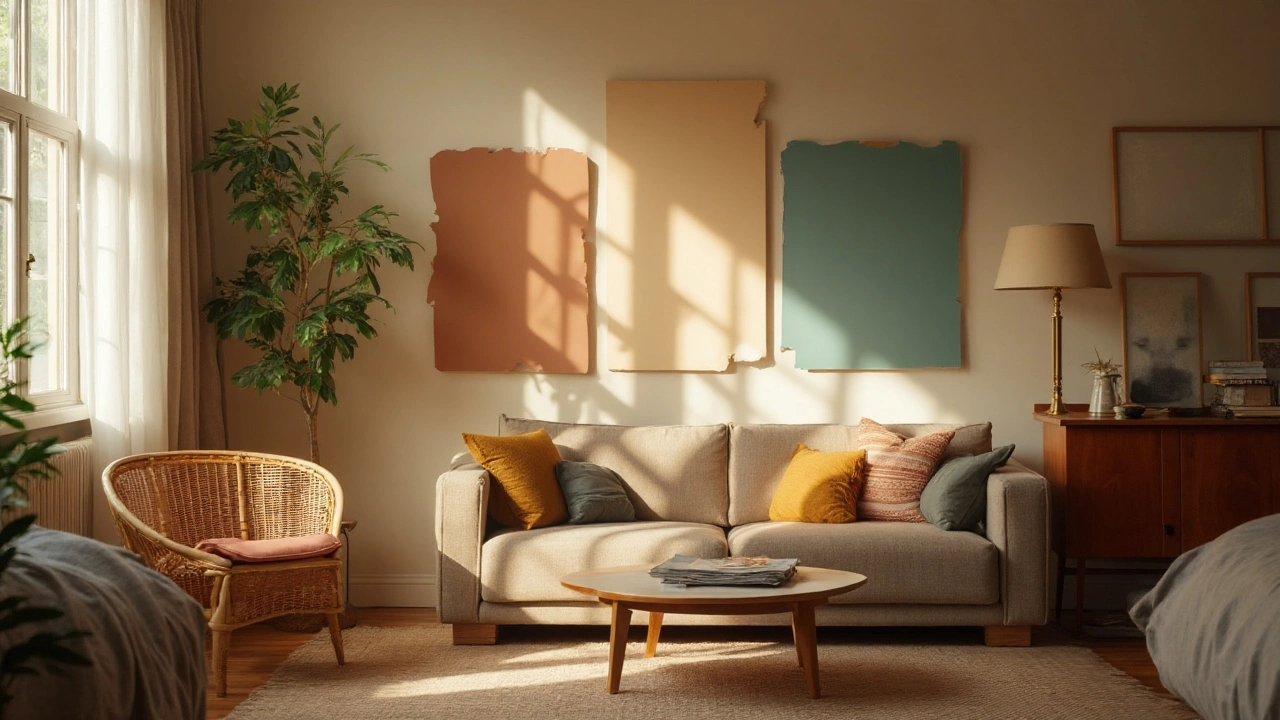
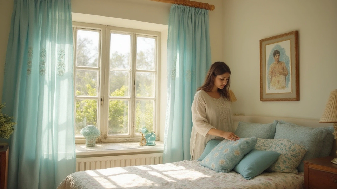
Bedrooms are sacred if coziness is your goal. You want cave-like ambiance at night and soft sunlight slipping in by morning. Layering is your mate here. One trick from Wellington interior designers: use a sheer cream or light sand panel behind a heavier drape, like rich forest green or chocolate. By day, pull back the heavy curtain for soft filtered light. By night, the thick curtain blocks out the world, wraps you in warmth, and mutes city noise. If you have trouble sleeping, studies show blackout curtains in deep, comforting colors help people drift off faster.
Kitchens and dining rooms need a lighter hand—coziness here means sunshine and breakfast chats, not blackout slumber. Mustard yellows, warm oatmeals, or breezy linen beige let in the morning sun without feeling sterile. If you like farmhouse style, try checked taupe or soft, washed terracotta. In open-plan homes, keep curtains in the same color family from room to room for flow. If you’ve already got bold walls, let the curtains fade back into the same warm-neutral palette—this stops the space from feeling cramped or busy.
Don’t forget about spaces like reading nooks, dens, or your gamer’s retreat. Deep blues or plum purple curtains make these spots feel exclusive—almost like a secret hideout. If you’re lucky enough to have a fireplace, picture soft amber or rust curtains that echo the flames, pulling your whole room into one cozy, glowing cocoon.
Here’s a super practical tip: Always test curtain colors with daylight and your evening lighting. Colors change wildly under different bulbs. Even the “perfect” warm beige might look flat at night under LED lights but come alive by candle or fireplace. Cut fabric swatches or buy a single panel as a tester, then live with it for a week before buying a whole set.
If you get stuck, technology has your back. Use augmented reality apps (check out “IKEA Place” or “Houzz View in My Room”) to see how curtain colors look on your actual window, at different times of day. Phone screens aren’t perfect, but it sure beats returning four sets of curtains because your “might work” guess fell flat in real life.
At the end of the day, the best curtain color is the one you actually want to come home to. If you love deep burgundy or retro avocado because it reminds you of your childhood, go with it. The science and stats are helpful, but nothing beats a feeling that makes your space your own.
Tips, Ideas, and Mistakes to Avoid for Achieving Cozy Curtain Perfection
Color is just part of the coziness formula—getting it right feels easy once you know the shortcuts (and the potholes to dodge). Here’s what I’ve picked up from a decade of wild goose chases across Kiwi houseware stores, plus mistakes you definitely don’t want to make.
- Don’t skimp on length: Curtains that just brush the window frame look skimpy. Go “puddle” style (where fabric pools slightly on the floor) or just-touching for that luxury, insulated effect. It feels lush, and extra fabric blocks more cold.
- Texture equals warmth: Even pale curtains get cozy if the material is thick. Chunky linen, heavy cotton, velvet, or suede—each type adds a tactile element that makes the brain register “comfort.”
- Layer for versatility: Layer sheer and blackout panels. Sheers in a soft cream or sandstone filter harsh sun; heavier panels in rust or forest green up the comfort factor at night.
- Mind your lightbulbs: Warm LED bulbs flatter rich curtain colors, making them glow almost golden at night. Cool white bulbs turn cozy earth tones dull and flat. Your curtain color choice will perform differently depending on what kind of lighting you use most.
- Subtle patterns are your friend: Too much pattern can zap the calm, but a gentle stripe, herringbone, or plaid in muted tones brings visual warmth, especially in minimalist spaces.
- Match undertones, not just main colors: If your walls have a yellow undertone, taupe or moss green curtains will feel in harmony. If your paint leans blue, try curtains with a gray or slate base.
- Never ignore room function: Want your office cozy but still focused? Swap out neons and brights for deep green or mid-tone blue. Want the nursery warm and calm? Pastel peach or butter yellow beats cold gray every time.
- Edit accessories to fit: Once you hang new curtains, weed out throw pillows, rugs, or art in clashing tones. This keeps the “cozy” effect consistent rather than chaotic.
- Don't let sunlight fade your hard work: In north-facing rooms flooded with afternoon rays, pick curtain fabrics with UV-resistant threads, or stick to deeper colors that fade less obviously over time.
- Maintain balance: If the room already leans dark—lots of wood, charcoal furniture—keep curtains a few shades lighter (warm beige, creamy latte, gentle terracotta) to lift the space. Too much darkness can feel claustrophobic.
Let’s bust a myth: “White curtains are the coziest.” Nope! White can feel bright, airy, and crisp—which is great for visual space, less so for a true nest. Off-whites, soft creams, or pale blush lend more warmth than hospital white. And steer clear of anything shiny or metallic unless you want “festive” rather than “comfortable.”
If you’re still indecisive, here’s a simple formula: pick two main color families for your home (say, deep green and sandy beige). Use one as the anchor in big rooms and the other for cozy accents—so your curtains and throw blankets echo each other, pulling the whole look together. Humans naturally relax deeper in spaces that feel unified.
For renters, don’t give up hope. Temporary curtain rods plus affordable, heavy curtain panels are easy upgrades. If your lease forbids holes and screws, tension rods or adhesive hooks get the job done. And since today’s fabric tech mixes machine-washable, fade-resistant, thermal, and blackout features, you’re not stuck with fussy dry-clean-only styles.
Here’s the real kicker: you don’t even need a huge budget to turn cold space cozy. The right curtain color—plus a bit of clever styling and some lived-in details—pulls even the gloomiest rental or bland builder house into “I never want to leave” territory. That’s the power of the perfect curtain hue. So, trust your gut, play with samples, and make your room a place that actually invites you in, rain or shine.