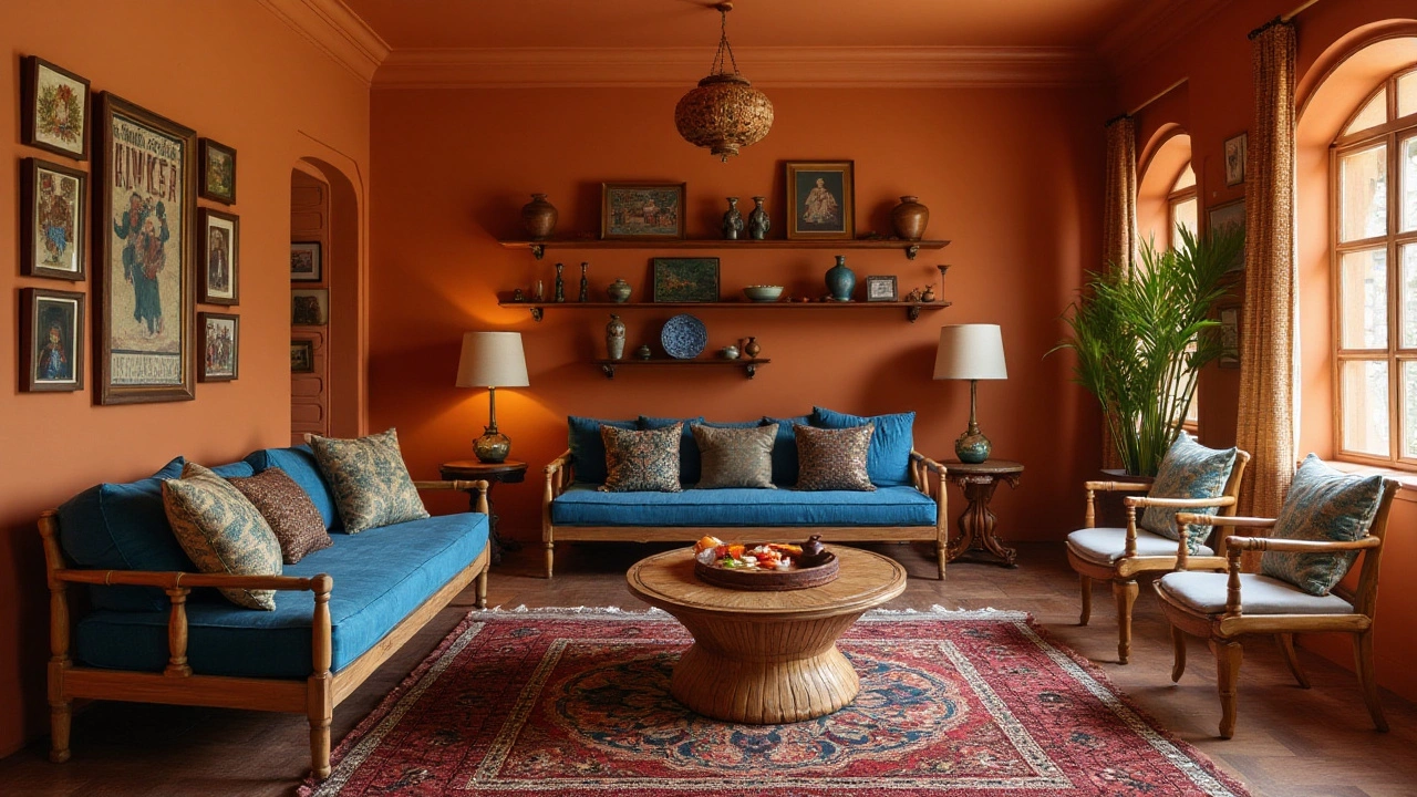
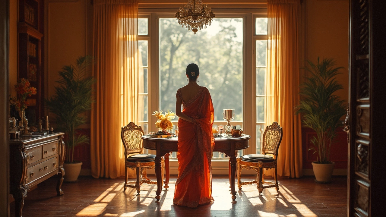
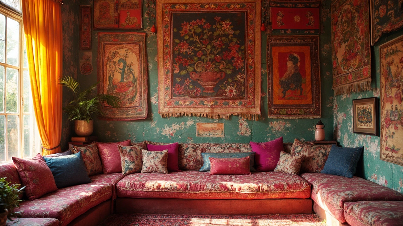
In the world of interior design, the 60-30-10 decorating rule is considered a classic strategy for achieving visual harmony. By dividing a room's colors into distinct proportions, it simplifies the often overwhelming task of creating a cohesive look.
This principle draws from an understanding of color psychology, using shades to influence mood and create an ambiance that feels just right. Whether you're sprucing up a living room or redefining a bedroom, this rule offers a straightforward method for crafting spaces that resonate with style and balance.
One of the beauties of the 60-30-10 rule is its versatility—it suits modern and traditional interiors alike, leaving room for creativity and personal touch. Uncover how this age-old guideline can transform your home decor into an eloquent statement of style and sophistication.
- Understanding the 60-30-10 Rule
- Why It Works: The Psychology of Color
- Applying the Rule in Different Spaces
- Common Mistakes and How to Avoid Them
- Inspirational Examples from Designers
- Tips for Personalizing the Rule
Understanding the 60-30-10 Rule
The 60-30-10 decorating rule is a mainstay in interior design because it offers an easy-to-follow framework for color distribution. Imagine a painter's palette, but for your living space. The concept is to use three colors in defined ratios: 60% for the dominant color, 30% for the secondary, and 10% as an accent. This approach helps ensure that the design is balanced and layered, avoiding the chaos that often comes with color choice.
The dominant color covers a broad swath of your room and often includes walls and larger furnishings. Choosing a neutral tone, like beige or gray, allows flexibility, but don't shy away from richer hues if you aim to make a statement. The secondary color adds depth and is typically used on items such as upholstered furniture. This is an opportunity to introduce complementary colors or patterns, adding interest to the dominant background. The accent color, making up the final 10%, is where magic and personality shine. Think throw pillows, art, or that quirky vintage vase from your last vacation.
Understanding why these proportions work ties back to art and human psychology. In painting, artists use the notion of the golden ratio, similar to how we apply the 60-30-10 rule in design, to create aesthetically pleasing compositions. People perceive natural scenes as harmonious because they often follow these ratios. It’s why a landscape painting, with its color distribution resembling sky, land, and elements like trees or people, feels 'right'.
But don’t just take it from me. As the renowned designer David Hicks said,
"The best rooms have something to say about the people who live in them."This philosophy resonates with tailoring the rule to speak to your style. Use this structure as a foundation but weave in textures, patterns, and cherished belongings that tell your story. It's not just about color; it's about creating a space that feels like home.
For those who thrive on details, consider the logic of statistics in color science; a balanced use of hue can reduce visual fatigue by offering the eye a tranquil but engaging environment. A study on color perception by the International Association of Colorists noted that using these defined proportions may increase the ease of navigation in a space, enhancing both comfort and functionality. Creating an inviting yet practical space starts with understanding how these elements work together.
Ogling the perfectly appointed showrooms before we set up our own spaces can feel daunting. But rest assured, this rule is like having a map—guiding without restricting the creativity that makes a house your home. Think of the colors as an orchestra, with the right conductor, and you will make the most beautiful music your eyes have ever heard.
Why It Works: The Psychology of Color
Color isn't just a visual element; it is an emotive tool that profoundly impacts our psyche. The significance of the 60-30-10 rule in interior design lies in its foundational use of color psychology to shape desired mood and atmosphere within spaces. Essentially, how colors are perceived relates not only to personal preference but also to cultural and psychological conditioning. The decorating rule takes into account these emotional triggers and arranges them into a comfortable and aesthetically pleasing setting.
When implementing the rule, 60% of a room's color is attributed to the dominant hue, acting as a backdrop that brings calm and unity. This majority color forms the base of your decor, ensuring it provides tranquility and harmonizes the rest of the elements within the space. On the other hand, 30% is for the secondary color, adding depth and interest, much like the supporting cast in a movie. This secondary shade enhances the main hue, providing necessary contrast and balance. Finally, the boldest color – the accent, fills the remaining 10%, acting as an exclamation point that creates visual intrigue and energy.
Research by the Institute for Color Research suggests people have subconscious judgments about an environment or product within the first 90 seconds, and as much as 90% of that assessment is based on color alone. Interestingly, this is why the strategic application of these ratios can create various desired emotional effects, whether it’s the cozy invitation of a warm living room or the serene calm of a blue-tinted bedroom.
"Colors, like features, follow the changes of emotions," famed artist Pablo Picasso once remarked, underlining the intimate connection between color and feeling.
Since each color carries its associations, nurturing a balanced palette becomes essential to ensure the home decor resonates emotionally with its inhabitants. Warm colors like reds, oranges, and yellows often convey energy, passion, and warmth, making them excellent for accentuating spaces with a social character. Cool colors such as blues, greens, and purples appeal more to tranquility and relaxation, which is why they are employed frequently as the dominant colors in bedrooms or bathrooms.
Understanding the psychological pull of hues also empowers homeowners to tailor the rule to fit personal needs. A bespoke living room can exude elegance by using a darker shade of grey or light beige, while its secondary color can include shades of slate blue for dimension, and bursts of mustard yellow for optimistic twists. This approach ensures that rooms do not only adhere to an aesthetic appeal but also cater specifically to the intended purpose of the space.
The scientific scrutiny into color perception demonstrates why no two experiences of a color scheme are identical. Lighting, texture, and cultural nuances further influence how colors are perceived. When orchestrating a new design, incorporating natural or artificial lighting conditions is crucial to evaluating how these aspects interact within the decor settings. Through these various lenses, the psychology of color manifests in diverse, dynamic ways, always with the potential to transform an ordinary room into an engaging experience.
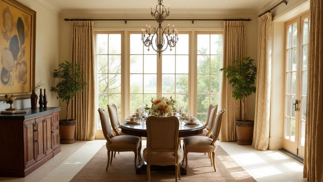
Applying the Rule in Different Spaces
When it comes to implementing the 60-30-10 decorating rule, no two rooms will use the principle in quite the same way. Diverse spaces call for unique interpretations of this guideline. Whether you're working with the expansive light of a living room or the serene intimacy of a bedroom, this rule can guide your choice of colors effectively. Start with the room's purpose and functionality as it dictates the dominant color, the one that will envelop roughly 60% of the space, to bring a cohesive foundation. Living areas often utilize earthy tones which create warmth and invite relaxation, while kitchens may thrive with brighter, invigorating hues like whites or muted greens.
Tackling the realm of secondary colors that fill 30% of a space, we look toward elements like furniture, drapes, or feature walls. This is where you imbue richness and depth. Bedrooms can benefit from calming, restful tones—as secondary choices like soft blues or greys are known to promote peace and tranquility. In a dining area, however, bolder, more dramatic shades can stimulate conversation and appetite, making dinners more vibrant. To ensure these secondary colors complement the dominant shade, consider them as your space's personality signature, reflecting a transitional element from overwhelming dominant hues to playful accents.
The magic truly unfolds at the 10% accent color that adds the final flourish and individuality to a room. Using decorative pieces, cushions, or art, this small percentage infuses a playful character or contrast into the design. Imagine the pop of a cherry-red vase against a backdrop of neutral tones or a splash of teal in an otherwise monochrome office. These seemingly minor details wield the power to elevate a design from ordinary to phenomenal, demonstrating how strategic splashes of an accent can transform mood and functionality seamlessly.
"The 60-30-10 rule is like a guiding principle to avoid amateurish mishaps in home decor. Once mastered, it leaves room for personal expression," reflects design expert Lily Drayton.
Sometimes technicalities are forgotten in practice, an occasional misstep occurs when the excitement of a fresh palette overwhelms. It is common, for instance, to unintentionally bleed an accent color into the secondary tier, or cluttering one's space with too many accent pieces, causing a visual disarray. Staying mindful of these boundaries keeps the scheme cohesive and purposeful.
Here is an enticing data-driven insight when deciding on these colors in different spaces:
| Room Type | Common Dominant Colors | Ideal Accent Colors |
|---|---|---|
| Living Room | Beige, Grey | Emerald Green, Mustard |
| Bedroom | Pale Blue, Soft Pink | Deep Navy, Burnt Orange |
| Kitchen | White, Light Green | Matte Black, Red |
Different spaces come alive following these time-tested guidelines, offering both structure and a playground for creativity. While the rule provides a well-edited approach to color balancing, remember it is only a map, not a law. It encourages exploration, allowing one's personality to unfold richly in their home's canvas.
Common Mistakes and How to Avoid Them
While the 60-30-10 decorating rule is a powerful tool in the hands of interior enthusiasts, even seasoned decorators can stumble by making some common mistakes. One frequent oversight is misunderstanding the concept of dominance in a room's color scheme. Many assume that 'dominant' translates to a single, bold color covering every surface, leading to an overwhelming space. Instead, the 60% should be a balanced backdrop, a color that feels inviting and relaxed, whether on walls or large carpet areas. Choosing a neutral tone that complements the home's architecture often works best, while warmer shades can define cozy nooks or dining spaces.
Another pitfall is mishandling the secondary color, the 30% in the mix. Often, this shade is either too close to the dominant hue, resulting in a lackluster effect or too far apart, creating stark and uninviting contrasts. It's crucial to think of the secondary color as the piece that holds the room's energy together, often applied on upholstery, curtains, or feature walls. A hue that is rich but not overpowering tends to bring a room to life. This is where creative exploration is encouraged; blending materials and texture can produce unexpected delights.
The accent color, the final 10%, is where individuality can really shine. However, this is where one of the trickiest errors occurs: overwhelming accents. Splashes of vibrant color should act like a surprise, an element of surprise that catches the eye without stealing the show. When every accent piece screams for attention, the room quickly loses its cohesive charm. 'Less is more' couldn't be truer here. Using accents sparingly, perhaps in the form of throw pillows, artwork, or a striking vase, can maintain balance and harmony.
A surprising slip-up is recklessly mixing patterns with the decorating rule. Patterns bring dynamism, yet when more than two or three clashing patterns coexist, the space can become chaotic. It's essential to match patterns within the same family of tones, ensuring they share a common thread. Sticking to a unified theme—whether geometric, floral, or abstract—can help the space maintain its composed allure.
"The essence of great design is balance, a command of contrast and unity," asserts renowned designer Kelly Wearstler. Her approach to pattern underscores the need for a thoughtful application of the 60-30-10 rule, ensuring that patterns enhance rather than disrupt.
Unexpected difficulties often arise when failing to account for lighting changes. Daylight shifts can significantly alter how colors appear, transforming the cozy warmth of morning into an evening’s harsh glare. Testing colors under different lighting conditions before full application can help avoid unpleasant surprises. Moreover, small sample patches painted across sections of the room can offer insight into these changes easily.
Finally, there's the error of neglecting personal style in pursuit of aesthetic trends. It's important to remember that a home should reflect its inhabitants as much as it showcases its design prowess. Allowing room for personal treasures and colors that evoke happiness ensures that the space doesn't just look fabulous but also feels like home. Keeping these common pitfalls in mind can help you wield the 60-30-10 decorating rule to create spaces that aren't just stylish but personally resonate too.
Inspirational Examples from Designers
Bringing the 60-30-10 decorating rule to life requires more than just following a formula; it requires a keen eye for aesthetics and a touch of creative ingenuity. Renowned designers have long advocated for this principle, not just in theory but through their stunning real-world applications. Take, for example, the celebrated work of Sarah Richardson. Known for her ability to blend contemporary with timeless elegance, Richardson often champions the use of the 60% dominant hue as a neutral base that sets the stage for bold explorations with colors. Her living room redesigns frequently feature soft greys or beiges, covering both walls and floorings, thus creating a calm and cohesive backdrop upon which the secondary and accent colors can shine.
In one particularly striking case, Richardson applied deep teal as her 30% secondary choice, leveraging it in the drapery and assorted textiles to create depth without overwhelming the space. The 10% accent was used inventively with bright coral trims and accessories—such as cushions and vases—to add vibrant pops that catch the eye and ignite interest. This method not only illustrates the versatility of the 60-30-10 rule but also underscores how it can be adapted to suit the personal style while ensuring harmony.
Another genius at wielding the 60-30-10 rule is the iconic Nate Berkus. His projects often emphasize earth-toned color palettes, grounding the design with a 60% dominant presence of warm whites or light tans. Berkus’s mastery shines through as he integrates 30% of deeper woods or clay hues, cleverly drawing the earthiness into furniture and focal pieces. What's fascinating about Berkus’s approach is how he uses the accent 10% to introduce bold colors through unexpected avenues like artwork or decorative artifacts, transforming potential afterthoughts into show-stopping highlights of the room. In his words, the rule offers a "frame to creativity" that guides yet never constrains.
"Color, like music, is a matter of personal taste, but applying a formula like 60-30-10 gives you the freedom to find harmony," remarked renowned designer Kelly Wearstler.
Wearstler herself is no stranger to the rule’s elegance. Her projects often push boundaries with the use of bold contrasts; a favorite is wide usage of charcoal as the dominant 60%, softened by brass metallics or deep emeralds as secondary hues. In her recent hotel project, she wowed spectators by elegantly melding pink and gold accents, a daring choice that redefined the vibrancy of the space while adhering strictly to the rule’s proportion.
For those eager to see numbers behind the magic, a study from the International Association of Color Consultants found that rooms designed with the 60-30-10 rule were 50% more likely to be judged as aesthetically pleasing by visitors. This statistic highlights not only the rule’s effectiveness but its universal appeal in creating spaces that speak to the art of living well. Through examining the work of these designers and others, one can see that while the rule lays down the ground, it’s the playful exploration within its structure that allows for true design innovation. Whether it’s Richardson’s playful teals, Berkus’s earthy warmth, or Wearstler’s bold contrasts, the 60-30-10 rule remains a trusted tool in the arsenal of expert decorators worldwide.
Tips for Personalizing the Rule
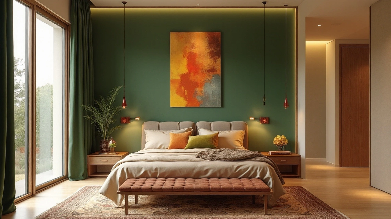
When it comes to using the 60-30-10 rule, the world is truly your oyster. This decorating strategy is as flexible as it is robust, allowing you to infuse personal style while retaining a professional touch. First, let’s explore how you can customize the dominant 60% base. Think of this as the canvas of your room. Although neutral colors such as greys, whites, or beige are popular for this portion, don’t shy away from selecting colors that resonate with you personally. For instance, if a soothing forest green or a soft sky blue wraps you in comfort, feel free to designate these hues as your room's backdrop. Doing so not only personalizes the space but also creates a comforting environment tailored to what speaks to you.
Moving on to the 30% segment, which acts as the supportive player in your decor scheme, this is where you can start introducing bolder, complementary colors. Choose shades that underscore your dominant color without competing for attention. It can be helpful to experiment with textiles in this section: think along the lines of plush throw pillows, an area rug, or even bold curtains. Texture and patterns here can add depth and character to the scheme, connecting the room's various elements together in a coherent manner. The aim is to build a visually stimulating environment without over-cluttering the senses.
Finally, the 10% accent is where your personal flair gets to truly shine. These are the decorative pillows, the eye-catching artwork, and the little details that draw the eye and add intrigue. Unique trinkets or a signature color that pops differently from your main and secondary choices can go a long way here. This is also an ideal opportunity to incorporate metallics or unconventional textures, like ceramic or glass. Notably, some interior designers suggest picking an accent color that echoes something from the natural world – blues reminiscent of water, or greens echoing lush foliage, as it can bring a lively touch to your decor.
"You have to get comfortable with color...take risks with it," advises renowned interior designer Justina Blakeney, highlighting the importance of stepping out of your comfort zone.
Don’t feel boxed in by the rule; remember that personalization is what transforms a house into a home. Each homeowner’s perception of beauty varies, so feel free to bend the proportions slightly to inject your unique personality into your space. If you are drawn to a predominantly dark palette, for example, you might opt for 60% of a deep shade, with brighter tones acting as the 30% or 10% for contrast. In the digital age, several online tools and apps allow you to visualize these schemes effectively, providing mock-ups before committing to the color on your walls.
| Color Composition | Potential Feel |
|---|---|
| Warm Tones | Cozy and Inviting |
| Cool Tones | Calming and Relaxed |
| Vibrant Tones | Energetic and Creative |
Lastly, engage with your environment: consider how natural light plays with your chosen colors, the feel of different textures under your feet or fingertips, and how these elements make you feel throughout the day. This sensory approach will help in ensuring the space is a true reflection of your essence. Keep this hearty balance: function meets style, and personal sentiment meets universal harmony, leading to a genuinely fulfilling living space.
