Ever walked into a room and just felt at home? It might have more to do with the colors on the walls than you think. The right shade can make a space feel warm and inviting, like a cozy hug. But how do you know which colors create that vibe?
Color psychology is a good place to start. Colors like deep browns, warm oranges, and muted greens are linked to feelings of comfort and coziness. Think about the sensation of sitting by a fire or being surrounded by nature—earthy tones often bring this sense of calm.
If earthy tones aren't your thing, you might consider soft neutrals. Shades like beige, taupe, or light grey can work wonders in setting a relaxing atmosphere. They're versatile and pair well with various accent colors, allowing you to change decor without repainting.
- Understanding Color Psychology
- The Warmth of Earthy Tones
- Soft Neutrals for Relaxation
- The Effect of Lighting
- Complementary Accents
- Practical Tips for Choosing Colors
Understanding Color Psychology
Colors aren't just for looks; they're all about feels. Imagine walking into a room painted in cool blues—you might instantly feel calm, almost like you're at the beach. That's the magic of color psychology, and it plays a big role in your living space.
Here's a fascinating fact: colors can influence our emotions and even behavior. For instance, warm colors like red, orange, and yellow can evoke feelings of warmth and coziness. That's why they often pop up in living room decor when the goal is to create an inviting atmosphere.
The Power of Warm Colors
When we're talking cozy, think about those earthy tones. Deep reds and warm browns echo the kind of warmth you get from a wood-burning stove. It's all about creating a nurturing environment without overloading the senses.
Calming Effects of Cool Colors
On the flip side, blues and greens have a calming effect. They can be great for reducing stress and making you feel at ease. While they may not scream "cozy" like warm colors, they add a serene vibe to your room.
Neutral Zones
Neutrals like beiges and grays are amazing for flexibility. These hues can keep things looking fresh and modern while still providing that understated coziness. They’re an excellent backdrop if you like to switch things up with colorful accessories.
Understanding the interaction between colors and emotions can really level up your interior design game. Next time you're choosing paint or decor, consider the mood you want to create. It's not just about what looks good; it's about how it makes you feel.
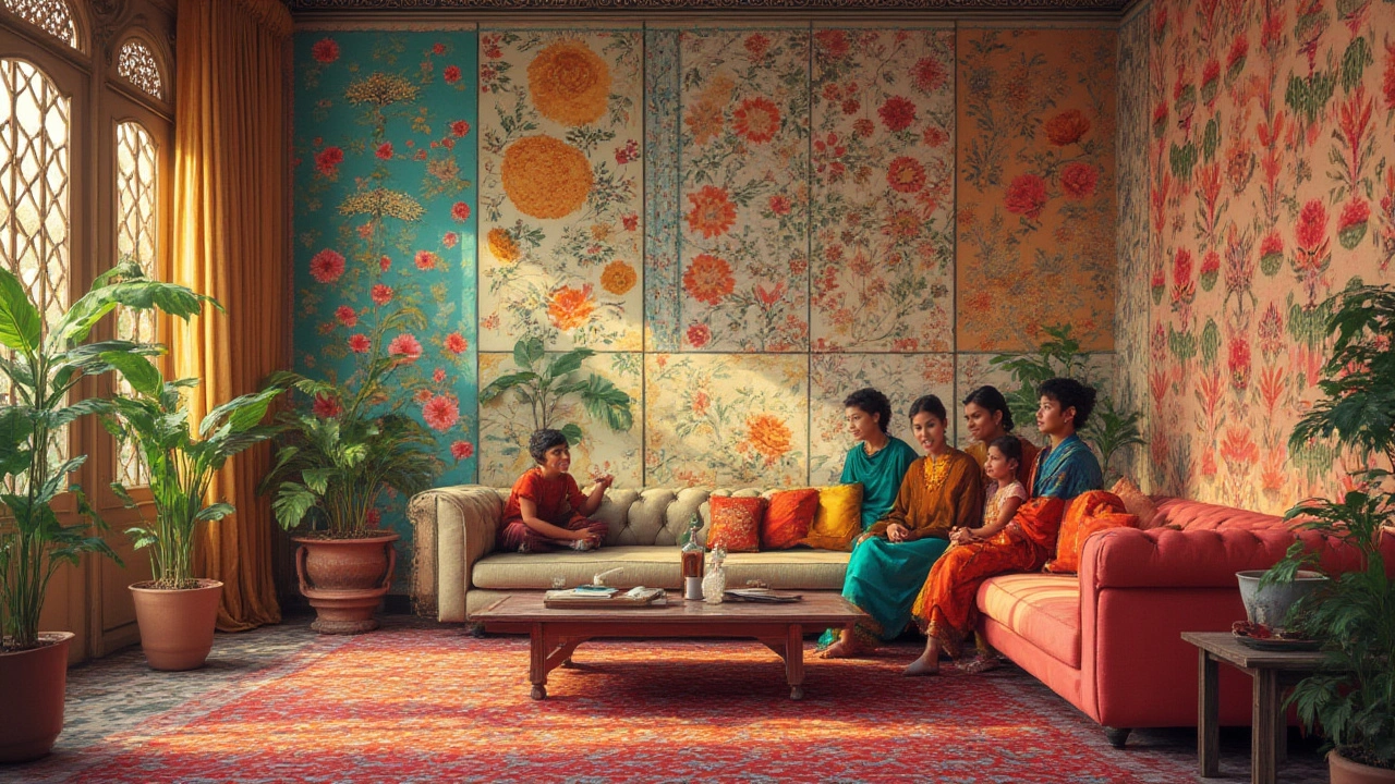
The Warmth of Earthy Tones
You know those rooms that instantly make you feel at ease? There’s a good chance they’re rocking some earthy tones. These colors are like the comfort food of the design world—they just feel good. We're talking about deep browns, warm oranges, and muted greens. They’re grounded and can make any space feel cozy and inviting.
Why Earthy Tones Work
Earthy colors are inspired by nature, which helps explain their soothing effect. Think about the calming influence of a forest or the steady reliability of rich soil. These colors make us feel connected to the earth, which naturally provides a sense of security and warmth. Whether it's a sandy beige reminiscent of the beach or an olive green bringing thoughts of a tranquil forest, these hues create a welcoming atmosphere.
Choosing the Right Earthy Tone for Your Space
The good news is that there’s a wide range to choose from. If your living room gets plenty of natural light, you might try a darker shade, like chocolate brown, to add depth. On the other hand, if you’re working with a dimmer area, a pumpkin orange or clay could bring in a bit of vibrance and warmth.
Combining Earthy Tones with Other Colors
To keep your space from feeling too heavy, mix earthy tones with other colors. You can pair a warm taupe with cream and dusty pinks for a feminine touch. If you’re more into a classic look, combine olive green with dark wood and white accents. Mixing in different textures, like wool or leather, can also help enhance the cozy color vibe.
Here's a small tip: when testing earthy tones, look at them in different lighting throughout the day. You'd be surprised how much they can change from morning to night, shifting the feel of your living room decor.
Soft Neutrals for Relaxation
Soft neutrals are like the Swiss Army knife of living room decor. These colors fit in anywhere and can turn your space into a zen zone. Think about colors like beige, taupe, and soft grays. They're not just easy on the eyes; they also have this amazing ability to blend seamlessly with just about any style of furniture or decorative accessory.
One great thing about using soft neutrals is their versatility. Got a vivid piece of art you want to showcase? The calm backdrop of a soft neutral wall will let those vibrant colors take center stage. Or maybe you're all about switching up your throw pillows with each season? These shades will give you that flexibility without the need to repaint.
Choosing the Right Shade
Staring at a wall of paint swatches can be overwhelming. So, here's a quick tip: consider the amount of natural light in your living room. A room with plenty of sunlight can handle cooler neutrals like a soft gray. But if your space is a bit on the dimmer side, warmer tones like beige might be more inviting.
Pairing with Accents
Once you've nailed down your soft neutral, it's time to pair it with accents. Think deep greens and blues for a pop of color, or stick with whites and creams for a minimalist feel. It's all about creating a vibe that feels just right for you.
Look at it this way: if your living room is the canvass, and you are the artist choosing soft neutrals, gives you a balanced backdrop to paint your masterpiece.
The Effect of Lighting
Lighting can make or break the cozy feel of your living room. It's like the unsung hero of interior design that often gets forgotten. That's right, the way you light your space can totally change how cozy colors look and feel.
Natural vs Artificial Lighting
During the day, natural light can bring out the best in your color choices. Sunlight often makes warm and earthy tones glow, emphasizing their inviting nature. But, as the sun sets, you'll have to rely on artificial lighting, which can change the game completely.
LEDs and fluorescent lights tend to cast a cooler, bluish light, which might not do justice to your warm colors. Instead, consider bulbs that mimic daylight or have a warmer hue to maintain that snug atmosphere. A simple switch in bulb type can make all the difference.
Layered Lighting for Ambiance
Ever heard of layered lighting? It's all about combining different light sources to create depth and mood. Start with ambient lighting, like overhead fixtures, for general illumination. Then, mix in some task lighting—a cozy floor lamp or a reading nook's spotlight could work wonders. Finally, add accent lighting, like small lamps or fairy lights, for that extra touch of warmth.
Dimmer Switches and Their Magic
Installing dimmer switches is like having a secret remote for coziness. They give you control over the intensity of your light, allowing you to dial it down for a movie night vibe or brighten it up for social gatherings.
The Magic of Candles
Don't underestimate the power of candles. Even a few tea lights can add incredible warmth and create an intimate atmosphere. They’re the cherry on top for crafting that welcoming space.
If you're going for a cozy living room, mixing and matching lighting types can turn any living space into a haven of comfort.
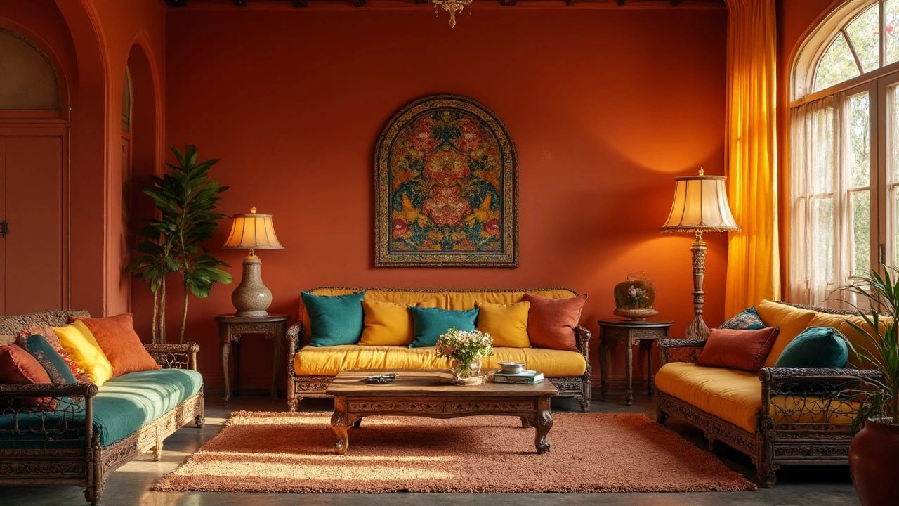
Complementary Accents
Once you’ve nailed the perfect wall color for creating that cozy feel, it’s time to think about accents that can really pull the room together. These little touches can bring life and balance to your living space. The secret here? Contrast can be your best friend.
Complementary colors sit opposite each other on the color wheel. So, if you have a warm terra cotta wall, adding some cool blue accessories can make everything pop. Think cushions, throws, or even artwork. It’s like adding a splash of excitement without going too crazy.
“A room should never allow the eye to settle in one place. It should smile at you and create fantasy.” – Juan Montoya, renowned interior designer.
Choosing the Right Accents
When picking out accents, don’t feel like you have to stick to one shade. Different textures in a living room decor can add depth, making a space feel more dynamic and cozy. Wooden elements, like an oak coffee table or a walnut bookshelf, can accentuate earthy colors beautifully.
- Metallics: Gold or brass fixtures can add warmth and are particularly striking against darker backgrounds.
- Plants: Adding greenery can soften a space and provide a natural touch that complements cozy colors.
- Art: A statement piece can act as a great focal point and tie all your decor elements together.
If you’re unsure about the right accents, start small. Pick a couple of pieces and see how they feel in the room. It’s a bit like trying on clothes: sometimes you don’t know it works until you see it together.
Practical Tips for Choosing Colors
Picking the right colors for your living room can feel daunting, especially if you're aiming for that cozy vibe. But don't worry, there's a way to get it just right. These tips can help you nail down the perfect cozy color for your space.
Test the Waters
Before committing to a color, try sampling a few options on your living room walls. Paint swatches are great, but a larger patch will give you a real sense of how the color looks at different times of the day. Remember, colors can look drastically different under artificial lighting versus natural light.
Consider the Room's Purpose
Think about how you use your living room. If it's your main relaxation spot, go for warm colors like soft yellows or gentle reds that exude warmth and comfort. If it doubles as a work-from-home space, neutral tones might offer a calming backdrop that won't distract during video calls.
The 60-30-10 Rule
This interior design trick can help balance colors in a room. Use your main color for 60% of the room (usually walls), a secondary color for 30% (like furniture), and a bold accent color for 10% (think pillows or artwork). It keeps your decor cohesive without overwhelming the senses.
Furnishings and Decor
Don't forget to consider existing furniture and decor. Your living room decor should complement the color scheme rather than clash with it. If you've got a bold-colored sofa, you might want to choose a more neutral wall color to let your furnishings shine.
Use Color Psychology
Colors have been shown to affect mood—it's not just theory. If you want a chilled-out space, blues and greens are often associated with calmness. For a lively environment, energetic reds or oranges might fit perfectly.
Sample Stats on Color Impact
| Color | Associated Mood | Common Use |
|---|---|---|
| Blue | Calm | Bedrooms, Living Rooms |
| Yellow | Warmth | Kitchens, Activity Rooms |
| Green | Tranquility | Offices, Living Rooms |
Every choice you make in your home should feel personal and just right for you. Don't stress too much about trends; go with what makes you feel comfortable. That's the ultimate goal—creating a living room that feels like a snug, welcoming oasis.