Ever felt stuck staring at dozens of paint swatches, wondering which color won’t look cringey in a year? You’re not alone. Picking the right shade sets the mood for your whole space before you’ve even bought a sofa.
This year, designers aren’t playing it safe. There’s buzz about earthy greens, moody blues, and spicy reds—yep, red is creeping back in. Instead of those flat grays from a few years ago, people want richer, comfort-first colors that make rooms feel alive (and honestly, more fun to hang out in).
Of course, slapping a trend color on every wall can backfire. Some hues look great online but end up giving your bathroom the vibe of an off-brand fast food joint. The key? Knowing what’s popular, but also what actually works in the space you’ve got. Let’s break down the color trends that are sticking around for 2024, plus how to use them without starting over next year.
- Why Color Trends Change
- Top Colors Everyone Wants Right Now
- Making Trends Work in Real Homes
- Tips for Keeping Your Space Timeless
Why Color Trends Change
Ever wonder why the color you just painted your living room in suddenly feels old news? It’s not just about keeping things fresh—there’s more to why interior colors 2024 look so different from last year’s picks.
Brands and paint companies actually put a ton of effort into choosing the “it” shades. They study what’s going on in the world—everything from tech and fashion to pop culture and even the economy. When times are stressful, people usually want calm, comfy colors at home. When folks feel upbeat, bold shades catch on. That’s why Covid lockdowns brought us all those cozy beiges and sage greens, while 2024 is seeing a surge in brighter, mood-boosting tones.
Designers and brands also look at what people are buying. For example, if sales data shows a jump in earthy browns and olive greens, you can bet you’ll see those in magazines and showrooms soon. And let’s be honest—social media plays a role too. If enough influencers paint their bedrooms terracotta, that shade suddenly feels like a must-have even before it hits the mainstream stores.
Here’s a quick peek at how color favorites shifted over the past five years:
| Year | Popular Color | Common Mood |
|---|---|---|
| 2020 | Soft beige, greige | Calm, grounding |
| 2021 | Pale green, dusty blue | Freshness, hope |
| 2022 | Warm clay, taupe | Comfort, coziness |
| 2023 | Deep navy, charcoal | Focus, relaxation |
| 2024 | Spicy red, earthy olive | Energy, connection |
Sometimes, companies like Pantone and Benjamin Moore even pick a “color of the year” to mix things up—after all, nothing sells new paint like a shiny new label. Still, trends are just a guide. Good color choices come down to what feels right for your space and your stuff—not whatever is blowing up on TikTok this week.
Top Colors Everyone Wants Right Now
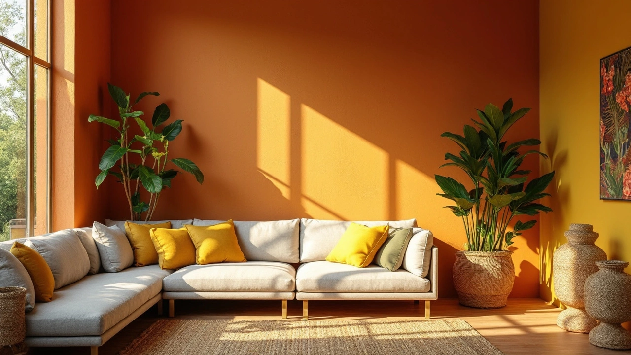
The big story for interior colors 2024 is that we’re done with just playing it safe. Earthy, grounded shades are showing up everywhere, and people love how chill they look in open living spaces, kitchens, and even bedrooms.
Greens—especially olive, sage, and moss—are huge. Paint companies like Sherwin-Williams and Behr put green at the top of their color picks this year. Green isn’t just trendy; it actually helps people feel calm and closer to nature, which is why it’s popping up in living rooms and home offices.
Moody blues are fighting for attention next. We’re seeing shades like deep navy and denim blue used for accent walls, cabinets, and even whole rooms. These colors bring drama, but they’re still easy on the eyes. Data from paint retailers in early 2024 show that dark blue sales jumped nearly 22% compared to last year.
Believe it or not, reds and terracottas are back. People want something bolder but still warm. Terracotta and burnt orange work great if you want cozy, energetic vibes—think reading nooks or kitchen backsplashes. As my daughter Delphi pointed out, even her friends noticed red popping up on TikTok interiors this winter.
Neutrals haven’t gone anywhere, but now it’s all about warm neutrals. Instead of cold grays, you’ll see creamy off-whites, soft beiges, and greige (that’s beige-meets-gray). These are the go-to colors for folks who want an easy refresh without getting stuck with something too bold.
| Color | Where It’s Used Most | Popular Shade Name |
|---|---|---|
| Olive Green | Living Rooms, Offices | Evergreen Fog (Sherwin-Williams) |
| Moody Navy | Accent Walls, Bathrooms | Hale Navy (Benjamin Moore) |
| Terracotta | Kitchens, Entryways | Redend Point (Sherwin-Williams) |
| Creamy Beige | Bedrooms, Hallways | Swiss Coffee (Behr) |
If you want to play it smart, start with a neutral base and add trendy colors in places you can easily change—like pillows, art, or a new coat of paint on one wall. That way, you keep your place feeling fresh without lots of hassle or regret spending.
Making Trends Work in Real Homes
It’s one thing to see all these trending interior colors 2024 splashed across Instagram, but making them click in your own space? That’s another story. Real homes have quirks: awkward corners, weird light, or maybe two kids (like mine) who turn white walls into a mural. If you want a trend to actually fit with your daily life, it helps to test-drive the color—literally. Buy sample pots and paint a few patches near windows, behind furniture, and someplace you always see in the morning.
Lighting changes everything. Earthy greens may look soothing in the living room, but under harsh overheads they can end up dull. North-facing rooms usually boost cool tones; south-facing ones can make warm colors almost glow. Here’s a quick cheat sheet:
- North-facing rooms: Try warm neutrals or faded terracotta for balance.
- South-facing rooms: Green and blue shades often look crisp and fresh here.
- Small spaces: Lighter shades open things up, but dare to go bold in a hallway or powder room.
Take a look at how the most popular paint colors are showing up in real homes according to a recent trend report:
| Trending Color | Where People Use It Most | Fun Fact |
|---|---|---|
| Olive Green | Living rooms, entryways | Calming, hides handprints |
| Muddy Blue | Bedrooms, bathrooms | Feels cooler, helps sleep |
| Spiced Red | Dining rooms, accents | Boosts appetite, conversation starter |
| Warm Taupe | Open floor plans | Matches almost everything |
If you’re not ready to paint every wall chili red or deep sage, that’s fine. Trends can live in small doses: a feature wall, a sofa, or even a splash of color behind open shelves. Just switching up throw pillows or curtains in a trending shade like muddy blue or warm taupe can update a whole room fast, with zero commitment.
Don’t forget, resale value matters. If you might sell soon, use bold colors as accents and keep larger surfaces in timeless neutrals. This way, you stay on-trend but nobody’s scared off by a neon kitchen when it’s time to move on.
Tips for Keeping Your Space Timeless
If you want your home to look good for more than one season, you can’t just copy and paste every modern interiors color trend from Pinterest. So, how do you pick interior colors 2024 that give off a fresh vibe but won’t have you reaching for the paint roller again next year?
The secret is in mixing trendy shades with classic color bases. For most rooms, that means saving the bolder colors (like deep greens or spicy reds) for accents—think pillows, art, or even the back wall of a bookshelf. Stick to reliable neutrals—like soft whites, gentle taupes, or warm clay tones—on big surfaces. These always have staying power and set you up for easy tweaks down the road.
Check this out: a 2023 Houzz survey showed about 68% of homeowners picked new colors for their renovation projects, and the majority chose variations of white, beige, or light gray for their main wall color. That’s proof basic shades aren’t going anywhere, even as new home decor trends come and go.
- Mix old and new: Use trendy pops—like a moss-green velvet chair or a navy accent wall—with classic furniture and flooring. It keeps rooms interesting but not loud.
- Test before you commit: Sample those bold paint colors on poster board or the back of a closet door. Live with them for a few days. Colors can look wild under different lighting.
- Lean on natural light: Some colors get dull or too intense depending on how much sun you get. Soft pastels and earth tones tend to play nice everywhere.
- Swap, don’t repaint: Change pillows, throws, and art first if you want a fresh twist. You’ll spend less and avoid a mess.
Want a quick look at what keeps working year after year? Take a peek at the shades that have hung around the longest with designers:
| Color Family | Staying Power | Best For |
|---|---|---|
| Whites & Off-whites | Very High | Walls, ceilings, trim |
| Neutrals (beige, taupe) | High | Living areas, bedrooms |
| Earth Tones | Rising | Accent walls, kitchens |
| Soft Blues & Greens | Consistent | Bathrooms, bedrooms, offices |
Basically, skip all-over neon or anything you’d describe as “trendy-for-now” when it comes to the big stuff. Make your base colors count, then play with trend shades in ways that are easy to change. You’ll thank yourself next spring.